
On this page
The simplest answer to how to make a gradient in canva is to select a background or supported object, open its color controls, and choose or customize a gradient in Canva.

A gradient blends colors across an area instead of filling it with one flat shade. It can give a plain background depth, connect brand colors, or help a short headline stand apart.
Start with a small palette. Two carefully chosen colors usually give you more control than a complicated blend. Add another color only when it improves the transition or helps the composition.
Canva’s dedicated gradient guide covers backgrounds, supported elements, and text. Interface availability can vary, so check the controls on your selected object rather than assuming every imported graphic supports the same editing options.
Start with a background gradient
A page background is the easiest place to begin because the blend can cover the composition without adding another foreground object. Canva’s background documentation describes both solid and gradient backgrounds.
- Open your design.
- Select an empty area of the page background.
- Choose Background color from the floating toolbar.
- Select a gradient tile.
- Review the result with your text and images visible.
If the toolbar shows photo or text controls instead, you selected an object rather than the background. Click a genuinely empty area and try again.
Use a preset first, even if you intend to customize it. That lets you evaluate whether the layout benefits from a gradient before spending time refining the colors.
Place the lightest and darkest regions deliberately. A light headline needs a reliably dark area behind it, not a background that shifts from readable to nearly invisible halfway through the words.
Keep the blend quieter when the page already contains detailed photography.
Create your own color blend
For a custom result, edit the gradient’s individual colors rather than lowering the transparency of the entire page.
- Select the object you want to edit.
- Open its Color tile.
- Under Document colors, choose Add a new color.
- Open the Gradient tab.
- Add or select a gradient color.
- Change that color to your preferred value.
- Repeat for the remaining colors.
- Choose a preset style under Styles.
Canva’s guide also describes dragging color stops to rearrange them. Use that control to change the sequence of the blend rather than adding more colors immediately.
Choose a clear starting pair. A dark blue and a lighter blue produce a restrained background. Blue and orange create a more pronounced transition that needs closer inspection through the middle.
For help choosing relationships between colors, the Canva Color Wheel provides a visual starting point.
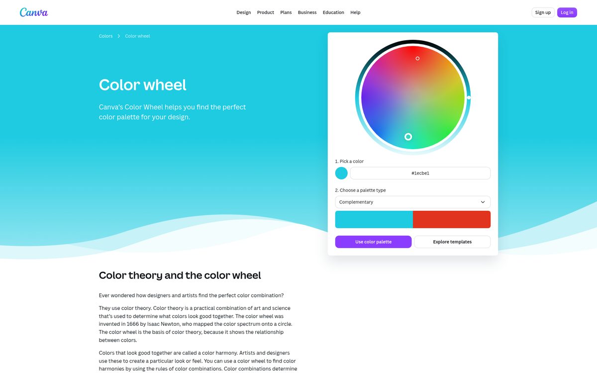
Treat color relationships as a guide, not a guarantee. A pleasing pair of swatches can still produce an awkward middle when blended across a large area.
Apply a gradient to a shape
A shape gives you a contained gradient area without changing the whole page. It works well for panels, labels, supporting graphics, and visual accents.
- Add or select an editable shape.
- Open its Color tile.
- Choose a gradient from the available options.
- Customize the colors if needed.
- Resize the shape to fit its role in the layout.
- Check the blend alongside adjacent elements.
Canva’s element-color guide notes that an element without color tiles does not support those color changes. An uploaded image or decorative graphic may therefore behave differently from a basic editable shape.
If the controls are missing, replace the object with a supported shape instead of assuming the feature is unavailable everywhere.
Give each gradient a clear purpose. A bright gradient panel behind a callout may help organize a page. Several unrelated gradient shapes can make the same layout feel noisy.
Avoid using a gradient to compensate for weak spacing. First arrange the content clearly, then add the blend as a supporting treatment.
Make gradient text where supported
For a short headline, try native gradient text controls before using image-based workarounds. Canva’s dedicated gradient guide explicitly includes text, although some older text-formatting guidance still describes gradients as unsupported.
- Select an editable text element.
- Open its text color or Color control.
- Look for the Gradients section.
- Choose a preset gradient.
- Customize the blend if the Gradient controls are available.
- Review the headline at its intended display size.
If your text selection does not expose those options, do not expect a gradient image placed behind it to become a text fill automatically. Check another ordinary text element and confirm that you are working in a supported design context.
The dedicated gradient guide says gradients are not supported in Canva Docs. Avoid treating a missing control there as a failure of the overall feature.
Use a substantial font and a short phrase. Fine strokes provide little room for the transition, while long paragraphs become tiring to read. Keep supporting body text in a dependable solid color.
For another headline treatment, see our guide to curving text in Canva.
Control fades and readability
A fade needs a transparent color stop, not merely a transparent object. Reducing an entire element’s transparency makes every part of it less visible; adjusting one gradient stop creates a transition toward transparency.
Canva’s gradient guide documents changing a stop’s transparency where supported. Select the gradient color stop you want to fade and adjust its transparency in the available color controls.
Use the result to soften a panel edge or gently reveal an image beneath it. Avoid relying on a fade to hide important details unpredictably.
Check these issues before approving the design:
- Does every word remain readable across the full blend?
- Does the middle of the gradient look muddy?
- Is the strongest color competing with the main subject?
- Does the effect remain visible at the final size?
When text crosses a changing background, inspect the weakest area rather than the most attractive one. A headline is only as readable as its least clear section.
If the design needs a cutout image over the gradient, our transparent-background guide explains the underlying format considerations.
Save a usable finished design
End with a real export check. Smooth transitions can look different once reduced, compressed, or displayed in another context.
- Inspect the complete composition at the intended viewing size.
- Remove unnecessary gradient colors.
- Check text against both the lightest and darkest regions.
- Export a test copy for the destination.
- Open the exported file and compare it with the editor.
Visible bands may become more noticeable in broad, subtle gradients. If that happens, inspect the exported result before changing the design randomly or repeatedly recompressing it.
Keep the editable design as your source so later color changes do not require rebuilding a flattened image.
A useful gradient supports the content without becoming the whole point of the page. Start with a preset, customize a restrained pair of colors, and add complexity only when it improves the final result.
Reach designers & developers at work
Sponsored posts, links and listings, each clearly labelled as sponsored. One sponsor per placement.
Become a sponsor