
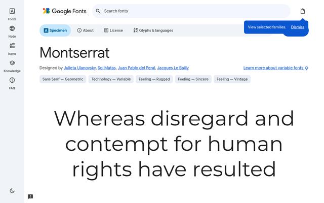
 MontserratGeometric sans by Julieta Ulanovsky, inspired by old signage in Buenos Aires. Variable from 100 to 900, a go-to for logos and websites.OFL
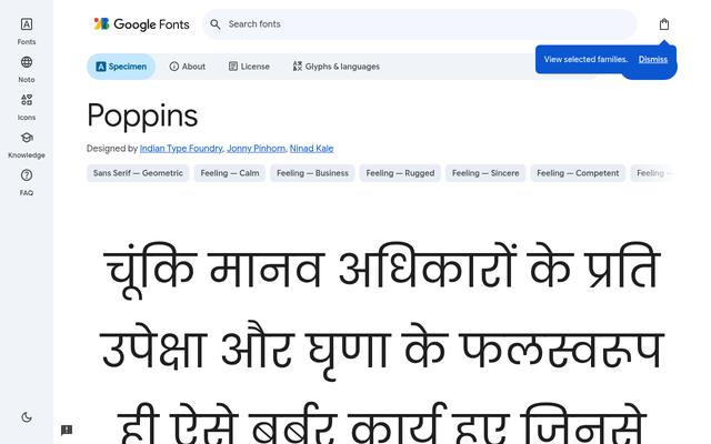 PoppinsGeometric sans from Indian Type Foundry with Latin and Devanagari support. Clean and modern for apps, decks and brand systems.OFL
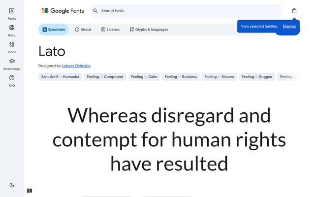 LatoWarm humanist sans by Łukasz Dziedzic with ten styles. Friendly and highly readable in body text, UI and reports.OFL
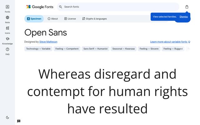 Open SansNeutral humanist sans by Steve Matteson, tuned for screens and print. A dependable default for interfaces and long reading.OFL
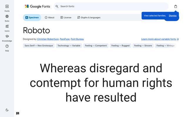 RobotoGoogle's workhorse sans with width and weight axes, used across Android. Solid for dashboards, apps and data-heavy layouts.OFL
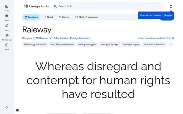 RalewayElegant sans by Matt McInerney and team with a thin-to-black range. Stylish in headings, especially its lighter weights.OFL
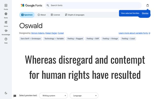 OswaldCondensed sans by Vernon Adams reworked from classic gothic styles. Fits big headlines into narrow columns and banners.OFL
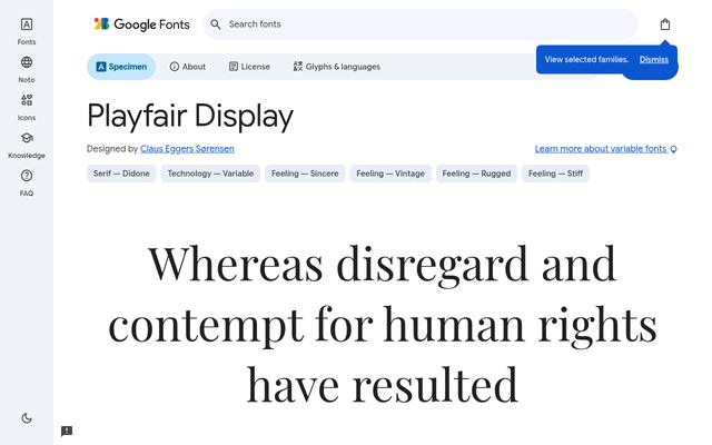 Playfair DisplayHigh-contrast transitional serif by Claus Eggers Sørensen. Gives magazines, fashion sites and invitations an editorial feel.OFL
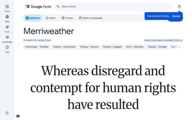 MerriweatherSturdy serif by Sorkin Type designed for comfortable screen reading, now with width and optical-size axes. Great for blogs and books.OFL
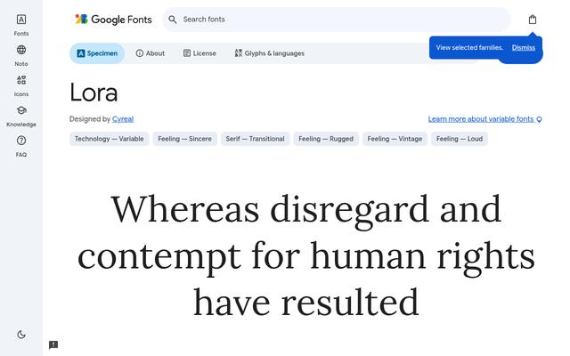 LoraContemporary serif by Cyreal with brushed curves. Pairs beautifully with sans headings for articles and storytelling.OFL
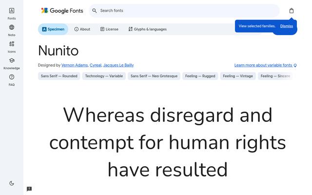 NunitoRounded sans by Vernon Adams with soft terminals and a huge weight range. Friendly for apps, education and kids' brands.OFL
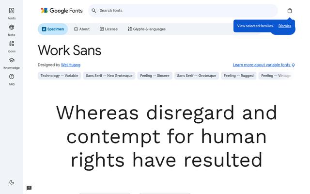 Work SansGrotesque sans by Wei Huang optimised for on-screen text in the middle weights. Clean for websites, portfolios and UI.OFL
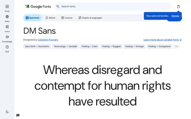 DM SansLow-contrast geometric sans by Colophon Foundry with an optical-size axis. Crisp at small UI sizes and bold in headlines.OFL
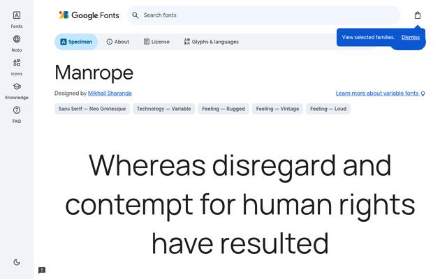 ManropeModern semi-condensed sans by Mikhail Sharanda that mixes geometric and grotesque traits. Popular for tech and SaaS brands.OFL
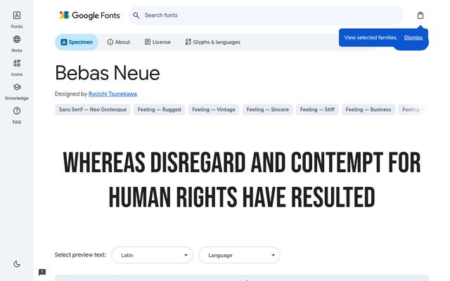 Bebas NeueAll-caps display sans by Ryoichi Tsunekawa. The classic choice for posters, thumbnails, film titles and bold headlines.OFL
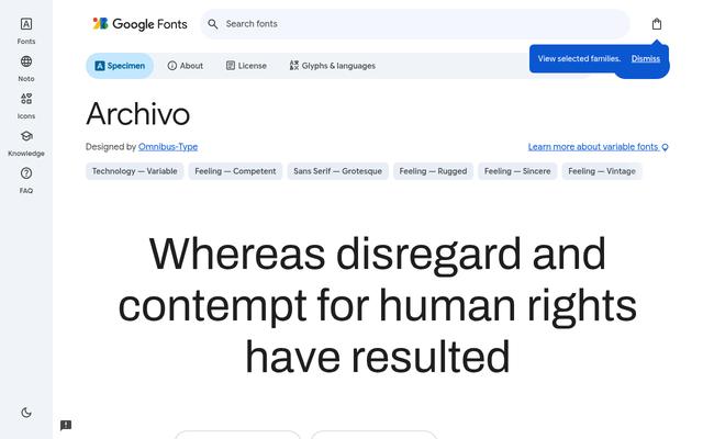 ArchivoGrotesque sans from Omnibus-Type with width and weight axes, built for both print and screens. Flexible for editorial and data design.OFL
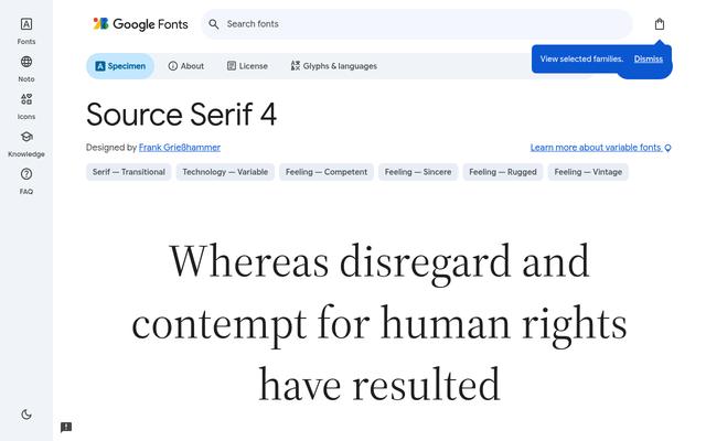 Source Serif 4Adobe's transitional serif by Frank Grießhammer with an optical-size axis. A polished text face for long-form reading.OFL
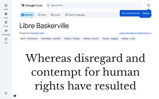 Libre BaskervilleWeb-optimised Baskerville by Impallari Type with a tall x-height. Classic and trustworthy for body text and books.OFL
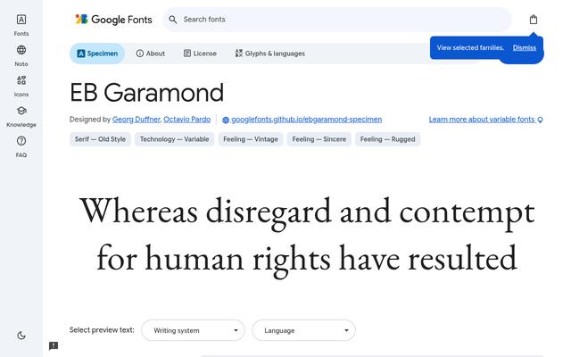 EB GaramondOpen revival of Claude Garamond's classic type by Georg Duffner and Octavio Pardo. Timeless for books, menus and literary sites.OFL
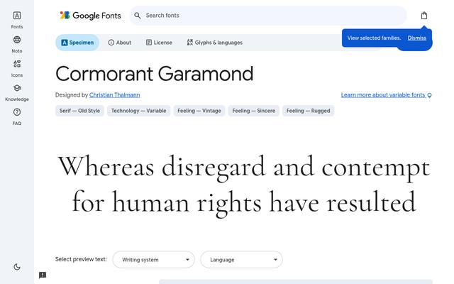 Cormorant GaramondDisplay-leaning Garamond by Christian Thalmann with sharp, elegant details. Luxurious for headings and wedding stationery.OFL
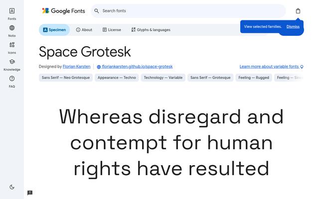 Space GroteskProportional sans by Florian Karsten derived from Space Mono, with quirky details. Distinctive for tech, crypto and design studios.OFL
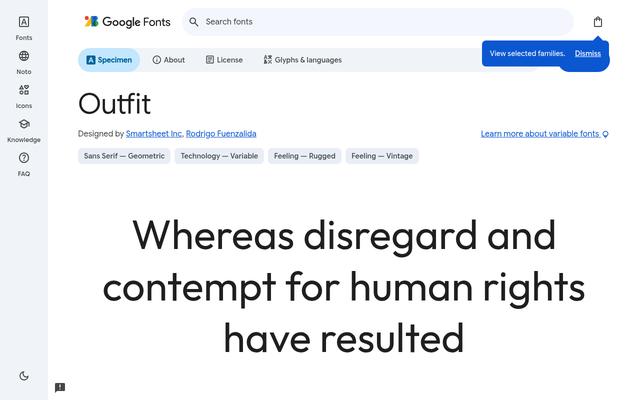 OutfitGeometric sans by Smartsheet and Rodrigo Fuenzalida with nine weights. Clean and contemporary for branding and product sites.OFL
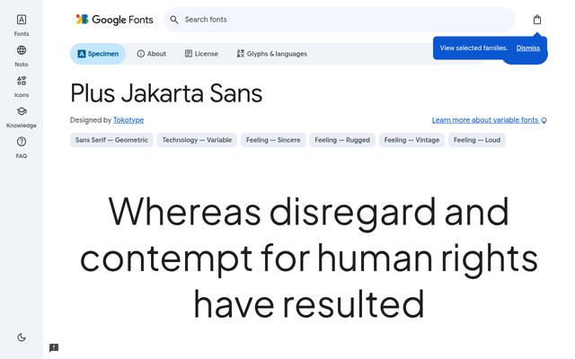 Plus Jakarta SansModern sans by Tokotype, originally made for the city of Jakarta. Polished for startups, landing pages and apps.OFL
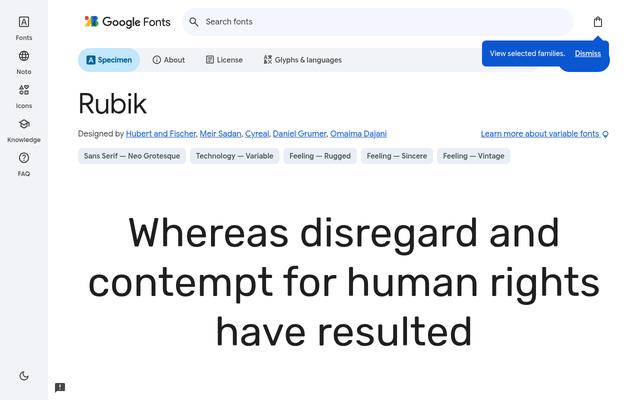 RubikSlightly rounded sans by Hubert and Fischer with Hebrew and Arabic-friendly companions. Soft yet solid for UI and headlines.OFL
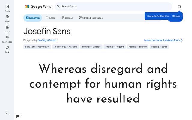 Josefin SansElegant geometric sans by Santiago Orozco with a vintage, Scandinavian flair. Great for fashion, interiors and minimal brands.OFL
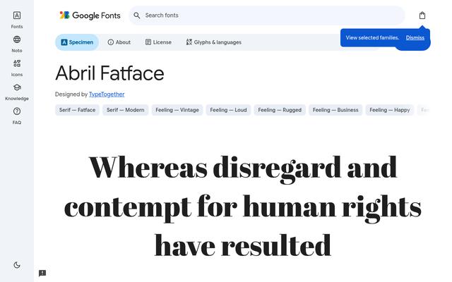 Abril FatfaceHeavy didone display serif by TypeTogether, inspired by 19th-century posters. Dramatic for magazine-style headlines.OFL
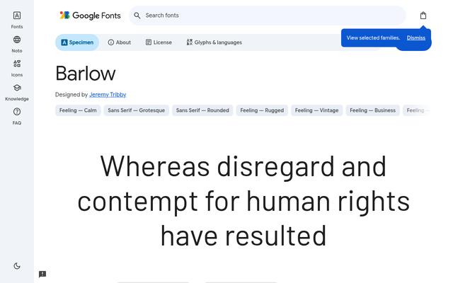 BarlowSlightly rounded grotesque by Jeremy Tribby inspired by California road signs. Highly legible for signage, UI and infographics.OFL
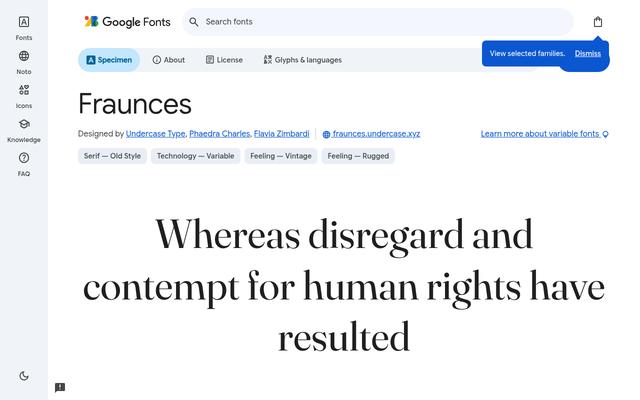 FrauncesSoft, wonky old-style serif by Undercase Type with playful SOFT and WONK axes. Characterful for food, publishing and lifestyle brands.OFL
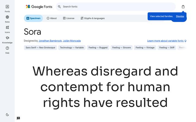 SoraGeometric sans by Jonathan Barnbrook and Julián Moncada, created for a tech platform. Sharp and clear for digital products.OFL
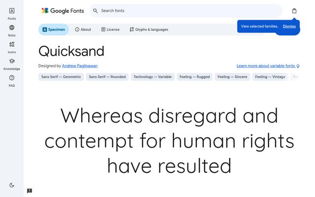 QuicksandRounded geometric display sans by Andrew Paglinawan. Friendly and light for wellness brands, apps and headings.OFL