
On this page
To curve text in Word, insert decorative text and apply a curved transformation in the desktop version of Microsoft Word; that is the standard way to make text curve in Word on Windows or Mac.
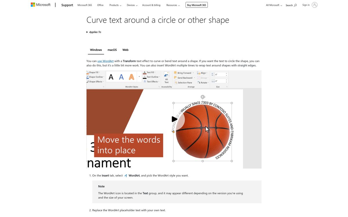
Curved lettering works best for short titles, badges, invitations, and labels. It is less useful for paragraphs because the unusual baseline makes longer passages harder to scan.
You do not need to arrange individual letters manually. Word can keep a phrase together as one editable object, allowing you to revise the wording after applying the curve.
Start with the final phrase if possible. Changing a short heading into a much longer one can substantially alter how it fills the selected path.
Check your version before starting
The important distinction is desktop versus browser editing. Microsoft documents the curved-text workflow for desktop Word on Windows and macOS. The browser version can display existing decorative text but does not provide the same creation workflow.
Microsoft’s WordArt guide describes inserting and styling this type of text, including the browser limitation.
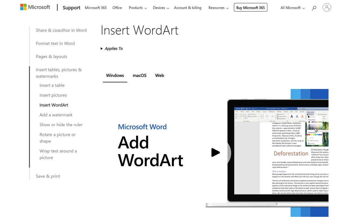
If you opened a document through a shared browser link, confirm whether you are still working in the browser. A missing command may be a platform limitation rather than a problem with the document.
On the desktop, ribbon labels can differ between versions. Microsoft’s instructions refer to Shape Format and, in some interfaces, Drawing Tools Format. These contextual controls appear when the relevant object is selected.
Do not look for the curve command among ordinary paragraph alignment buttons. Centering text changes its horizontal alignment; it does not bend the baseline.
Insert the text you want to bend
Use one editable decorative-text object for a simple curved phrase.
- Open the document in desktop Word.
- Select Insert.
- Choose WordArt.
- Pick a starting style.
- Replace the placeholder with your own wording.
- Select the inserted object.
The starting appearance is not a permanent decision. You can change the font, size, fill, and outline afterward. Choose something readable so the initial styling does not distract from adjusting the curve.
Keep the first attempt short. A few words are easier to fit than a long sentence with several punctuation marks.
Microsoft also documents converting existing selected text through Insert and then WordArt. If the wording is already in the document, this can save retyping, but inspect the result before deleting any original copy.
Avoid creating a separate object for every letter. That makes spelling changes, spacing, and later resizing unnecessarily difficult.
For font selection, our serif versus sans serif guide explains the basic differences without requiring you to test an entire font menu.
Apply the curved transformation
The key command is Text Effects followed by Transform. This changes the shape of the selected decorative text rather than the outline of an unrelated box.
- Select your WordArt text.
- Open Shape Format.
- Select Text Effects.
- Choose Transform.
- Pick the curved appearance you want.
- Click outside the object to inspect the complete result.
For lettering that follows an arc or circle, use the path-following options rather than assuming every distorted preview produces the same kind of curve. Some transformations reshape the letters themselves more strongly.
If the correct tab is not visible, select the decorative-text object again. Clicking ordinary document text returns you to a different set of controls.
A common mistake is choosing a shape effect instead of a text effect. A shadow or bevel on the surrounding object does not curve the words.
Make one change at a time. Select the transformation first, then adjust the box size, and only then refine the font. That sequence makes it easier to understand why the result changes.
Fit the curve to a title or circle
After applying the effect, focus on the object’s proportions. Microsoft specifically documents dragging sizing handles to adjust the size and shape of circular WordArt.
- Select the curved object.
- Drag a sizing handle to adjust its dimensions.
- Inspect how the words spread along the path.
- Adjust the font size if the phrase feels crowded.
- Recheck the complete design at normal viewing size.
For a full circular treatment, Microsoft’s documented route is Shape Format, Text Effects, Transform, and then Circle under Follow Path.
Do not assume choosing Circle guarantees that any phrase will immediately look like a balanced seal. The length of the wording, the font, and the object’s dimensions all influence the result.
Use a short title for a shallow arc. For a circular badge, leave enough room around the center so the text does not collide with an image or symbol.
If you want words along several straight edges, Microsoft recommends using separate decorative-text objects for those edges. A single circular transformation is not a general-purpose layout system for every possible shape.
Refine color and troubleshoot missing controls
Once the curve works, prioritize readable letterforms over decorative styling.
You can change the font through the usual font controls and use the contextual text fill and outline options for the selected decorative text. Avoid stacking several strong effects on a small heading.
Check these common problems:
- No contextual formatting tab: select the inserted object again.
- No curve controls in the browser: use desktop Word.
- Text looks stretched: reconsider the transformation and object proportions.
- Letters feel crowded: shorten the phrase or adjust its typography.
- The curve works but is hard to read: simplify the font and styling.
Judge the result against its actual background. A thin outline can disappear over a photograph even if it looks clear against a blank page.
Windows and Mac follow the same overall approach, but do not expect every ribbon to occupy the same space or show identical labels. Follow the command names Microsoft documents for your version rather than relying on a screenshot from another release.
Check the document where it will be used
Finish with a recipient-side review rather than assuming a successful edit guarantees a successful handoff.
- Save the document.
- Reopen it and verify the wording.
- Inspect the curved title at normal reading size.
- Check the page layout around the object.
- If the recipient uses browser editing, confirm that the existing artwork displays as intended.
- Review any final exported or printed copy separately.
Keep an editable document as the source. A flattened image may preserve an appearance, but it is less convenient when a date, name, or phrase changes.
For graphics created outside a word-processing document, our Canva curved-text guide offers a separate design workflow.
Use the lightest treatment that communicates the idea. A short, balanced arc usually works better than a heavily distorted heading, especially on invitations and small labels.
Reach designers & developers at work
Sponsored posts, links and listings, each clearly labelled as sponsored. One sponsor per placement.
Become a sponsor