
On this page
The simplest answer to how to outline text in photoshop is to select a type layer and apply a stroke as a layer effect in Photoshop.
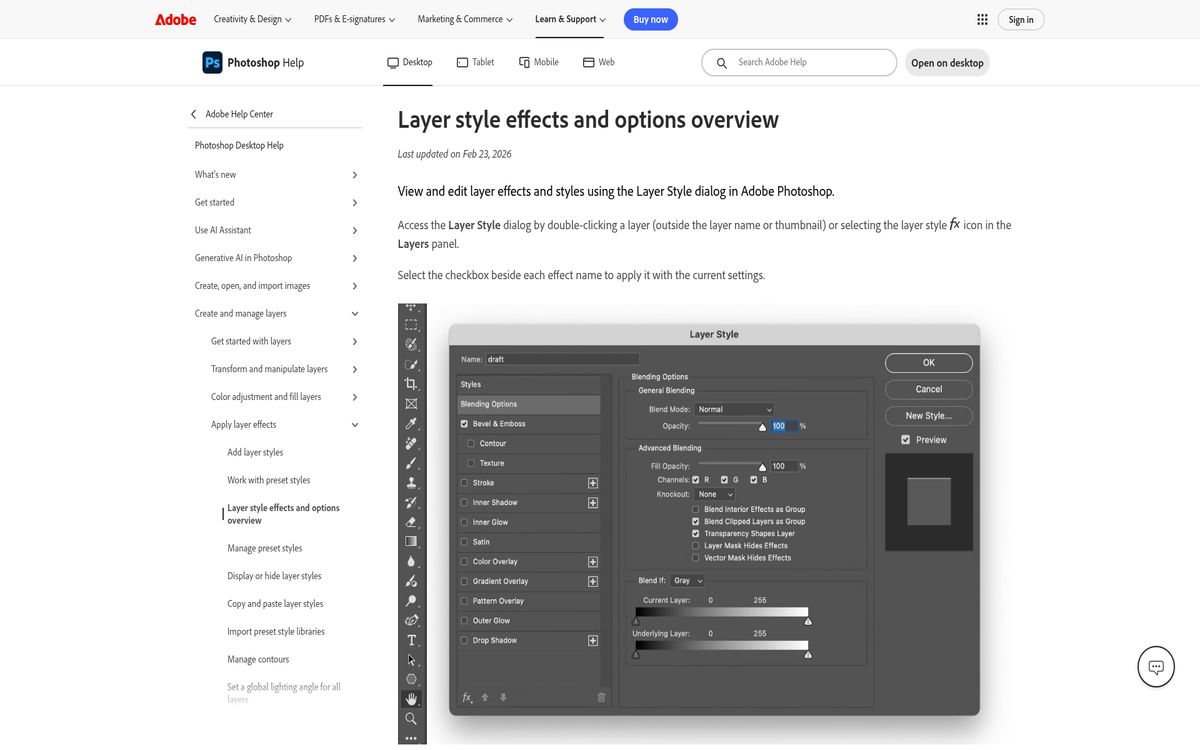
This keeps the wording editable while adding a visible edge around the letters. You can change the text later without manually rebuilding the outline.
Use this desktop workflow for titles, labels, thumbnails, and short display typography. The strongest result usually comes from a readable font, a restrained outline, and enough separation from the background.
Before starting, decide whether you want filled letters with an added edge or hollow letters with only the edge visible. Both can use a layer effect, but the second requires a separate fill adjustment.
Prepare an editable type layer
Begin with live text rather than flattened pixels. That preserves your ability to correct spelling, change the font, and adjust the wording after styling.
- Open the document.
- Create your text or select an existing type layer.
- Finish the main wording.
- Choose a readable font and approximate size.
- Confirm that the intended layer is selected.
If the text is already part of a flattened image, a normal type-layer workflow cannot recover its original font and characters automatically. Recreating a short heading as editable text may be cleaner than outlining its existing pixels.
Keep the background visible while styling. An outline that looks attractive against transparency may not separate the words from the actual photograph or graphic beneath them.
Choose a font with enough room inside its letters. Very narrow counters can become crowded once an outline is added.
For help selecting a type style, our serif versus sans serif guide explains the main visual differences.
Add the Stroke layer effect
Use Layer Style Stroke when you want a nondestructive outline that follows the text as it changes.
- Select the type layer in the Layers panel.
- Choose Layer, then Layer Style, then Stroke.
- Enable the preview if needed.
- Set the stroke size.
- Choose its position.
- Choose the stroke color.
- Confirm the settings.
Start with a modest size and increase it while watching the whole word. The goal is usually to define the letters, not to replace them with a thick outer silhouette.
A contrasting color can separate a heading from its background, but avoid assuming black or white is always correct. Compare the stroke against both the letter fill and the image behind it.
If nothing appears, confirm that the effect is enabled and that the selected layer is the intended text layer. Also check whether the stroke color is simply blending into the surrounding design.
Because this is a layer effect, you can revisit the settings instead of painting a new outline each time the text changes.
Choose outside, inside, or center
Stroke position determines where the outline occupies space relative to the letter edge.
Outside extends the effect outward. It is often a useful starting point because it preserves more of the visible interior of the letters. A heavy outside stroke can still close narrow gaps between neighboring characters.
Inside places the stroke within the letter boundary. It keeps the outer silhouette more contained but can consume a substantial portion of thin letterforms.
Center places the stroke across the boundary, distributing it on both sides. This can work for some display styles, but it still changes the visible balance between the fill and the surrounding edge.
Compare the positions rather than choosing one by habit:
- Begin with the same stroke size.
- Preview Outside.
- Compare Inside.
- Compare Center.
- Inspect narrow letters and enclosed spaces.
- Keep the option that preserves the clearest word shape.
Do not judge only one oversized letter. View the full phrase, including punctuation and spaces. A setting that works for a bold initial can make the rest of the heading look cramped.
Make outline-only text with Fill
For hollow lettering, change Fill rather than overall Opacity. Adobe’s opacity and blending guide distinguishes the layer’s content from its effects.
- Select the styled type layer.
- Keep the Stroke effect enabled.
- Locate Fill in the Layers panel.
- Set Fill to 0%.
- Leave overall Opacity at 100% for a fully visible effect.
- Inspect the result against the background.
The distinction matters because overall Opacity affects the layer and its effects together. Lowering that control to zero can hide the outline you intended to keep.
Fill controls the visibility of the layer’s own text content without making the stroke disappear in the same way.
This creates an outline-only appearance while retaining editable wording. It does not require deleting the letter interiors or rasterizing the type.
Keep the background simple enough for hollow letters to remain recognizable. Detailed photographs can show through the interiors and make short words harder to read.
Convert text to a shape only when necessary
Use shape conversion for path editing, not as the default way to add an outline. Adobe documents converting text to shapes or work paths as a separate workflow.
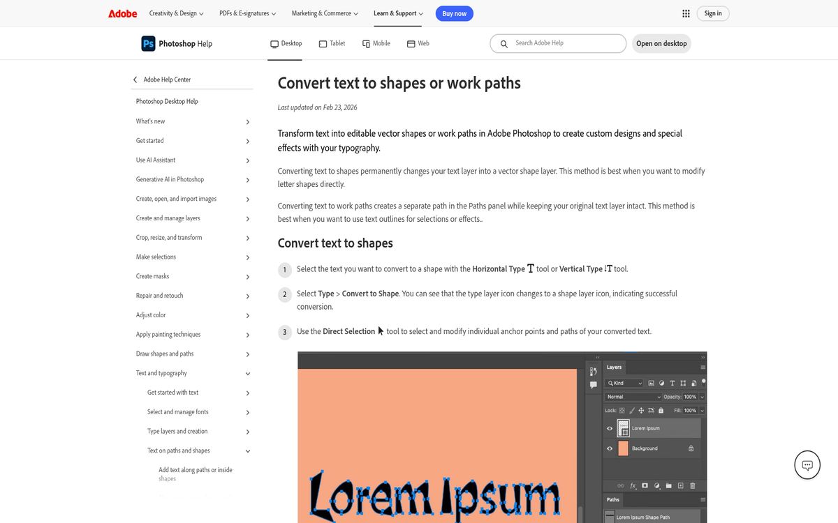
- Keep an editable copy of the original type layer.
- Select the copy you intend to convert.
- Choose Type, then Convert to Shape.
- Use the resulting shape when you need to work with its paths.
- Return to the preserved type layer if the wording changes.
Once converted, the result is no longer ordinary text you can revise by typing. That trade-off is worthwhile for custom letterform work, but unnecessary for a routine headline outline.
Also distinguish shape strokes from layer-effect strokes. Both can create an edge, but their controls belong to different kinds of objects.
For a simple editable outline, stay with live type and the layer effect. Convert only when you can name a specific path-editing requirement that the type layer does not meet.
Inspect and preserve the finished result
Finish with an actual-size readability check. A dramatic effect at high zoom can become a clogged or blurry heading when reduced.
- View the design at its intended display size.
- Inspect small enclosed spaces in the letters.
- Check that adjacent characters remain distinct.
- Confirm that the outline separates the text from the background.
- Save an editable layered source.
- Review a final exported copy.
If the outline feels too heavy, reduce its size before changing the entire font. If the words still disappear into the image, simplify the area behind them rather than adding more effects indefinitely.
When a cutout subject is part of the composition, our Photoshop background-removal guide covers that separate task.
Keep the type editable for as long as possible. A restrained stroke, the right position, and a clear background usually produce a more useful result than stacking several decorative treatments.
Reach designers & developers at work
Sponsored posts, links and listings, each clearly labelled as sponsored. One sponsor per placement.
Become a sponsor